
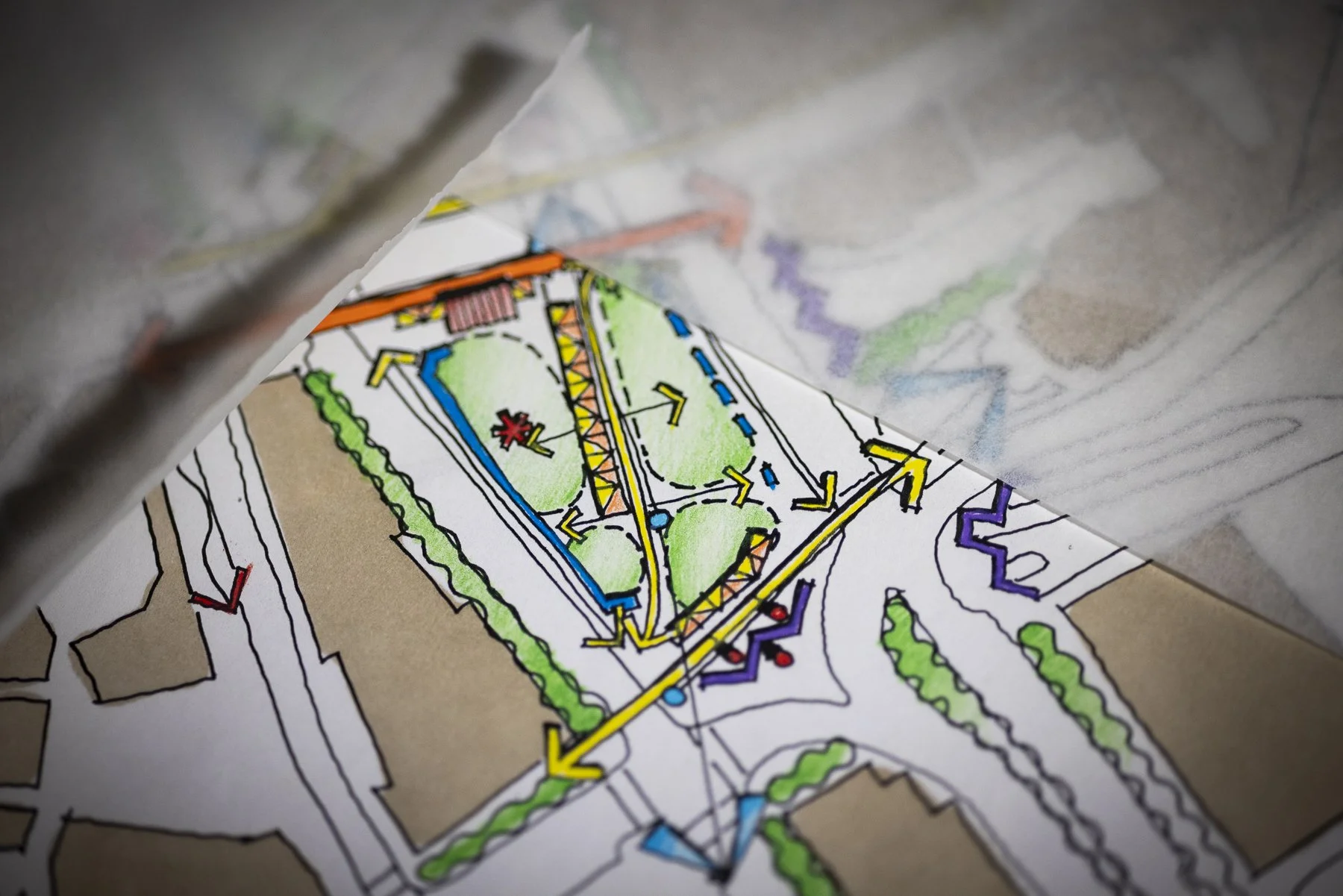
We started the New Year with sharing our refreshed Tighe & Bond brand, an updated visual identity that better reflects who we are today and where we’re headed. Since the Halvorson team joined Tighe & Bond back in 2020, we’ve enjoyed the collaboration of being part of a multi-disciplinary practice, affording our clients an even wider array of services, while still offering the high-level of design and planning services our clients have come to trust. Our studio will retain the name of Halvorson to honor our legacy - while unifying our visual identity within the Tighe & Bond brand, we’ll still refer to ourselves as Halvorson, Tighe & Bond’s in-house design studio.
While our look has evolved, the values that guide us remain the same. Each element of the new logo was thoughtfully designed to represent Tighe & Bond’s diverse service offerings, our people, our culture, and the trust we build with our clients and the communities we work within every day.
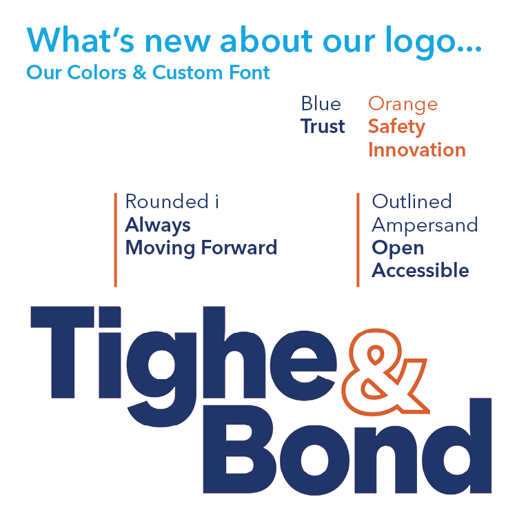
Color with Purpose
Our refreshed color palette is rooted in meaning.
Blue represents trust — the trust our clients and communities place in us, and the trust we have within our firm as colleagues and employee owners. It reflects reliability, professionalism, and the long-standing relationships at the core of our work.
Orange represents safety and innovation. Safety is one of our core values, and orange reinforces our commitment to protecting people, communities, and the environment. It also speaks to innovation — our drive to think creatively, adapt, and move solutions forward. It was also a key color in the Halvorson brand.
Designed to Move Forward
We introduced a custom font as part of our new logo to make our brand distinctly our own. One subtle but meaningful detail is the rounded dot of the “i,” in “Tighe” which symbolizes continuous movement, progress, and momentum—moving forward, together.
We also made a deliberate choice to outline the ampersand (&). This design element represents openness and collaboration, reflecting our belief in shared ideas, teamwork, and inclusive thinking. It communicates our accessibility — to our clients, our partners, and each other— and our openness to new ideas and perspectives.
Meaning behind the Artwork
This new logo is more than a visual update. It’s a reflection of our values, our culture, and our commitment to trust, safety, innovation, and collaboration. It honors where we’ve been while looking confidently toward the future.
We’re proud of this next chapter — and we’re excited to share it with you.